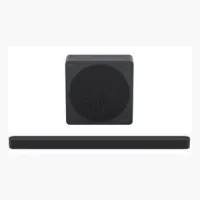
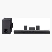
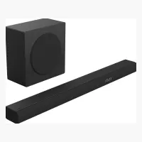
See exactly where one beats the other — with numbers, not adjectives.
301 models since 2020 on one chart: each dot is a model. The dashed line is the median weight for a given output power.
Axes run from the 1st to the 99th percentile; extreme values are left off the chart.